

Saturday, 29 September 2012
Tuesday, 25 September 2012
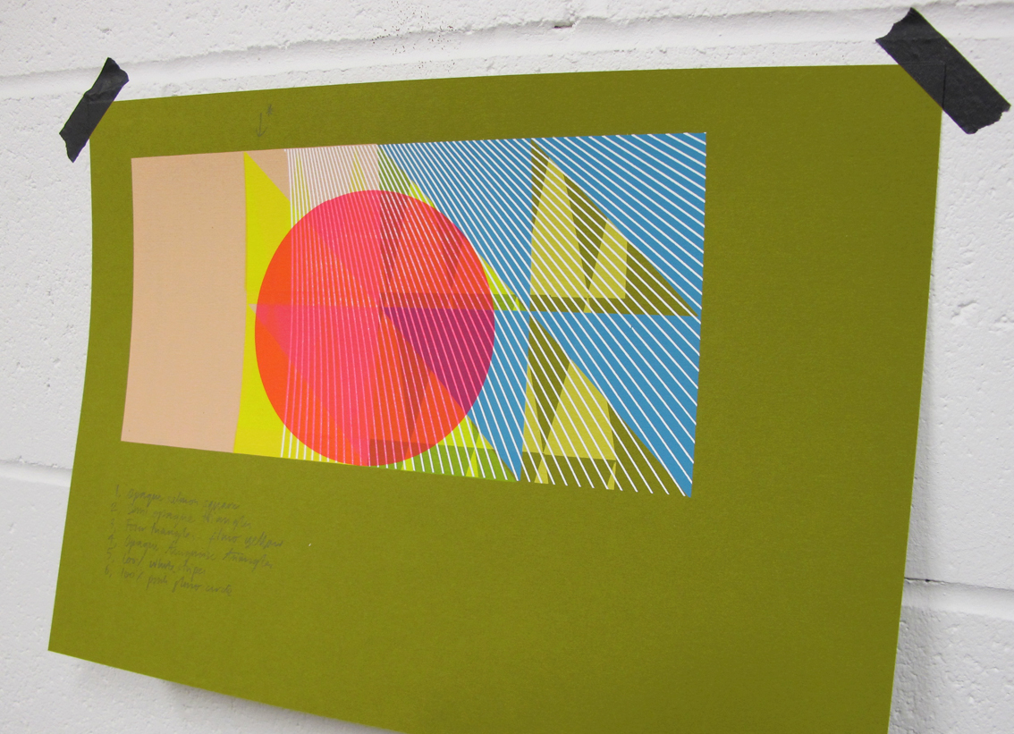
Prepping for new Editions, finally..
It's been thirteen months since I last released a Print Edition. Mentally I've released many more since, unfortunately they never made the paper. So now I'm preparing, testing & playing around with coloured textured stocks to avoid the blank white stare of my usual Fabriano and help shift me along a little. I hope to get carried away with these twenty minute samples and before long turn around to a great pile of them.. probably after eyeing up this Wallpaper Sample book by Alex Girard.

Thursday, 20 September 2012
'C, Y, M... K?'

Tonight I re-found this slightly bonkers image proposal for a 'Sonny J' single cover test, created a few years back. Just as budgets for sleeve campaigns were truly dying out, myself & Patrick Duffy managed one last pop at silkscreening a set of sleeves, the starting point for each being the colour separation of various found photography. (You definitely needed a decent expenses budget to tackle this.) With my slightly self taught approach to the technical side of printing in CYMK in tact I took this shot after applying only the cyan, yellow & magenta. When it looks like this, who needs the black? was my thinking. Without its application it only enhanced an already pretty unusual image.
Friday, 14 September 2012
Hundreds & thousands..
I'm not exactly sure why I can't stop documenting these incidental details of recent prints in progress. Working with pattern and layering up textures seems to conjure up a steady stream of printed revelations. Each one a perfect & unique image to me, that would otherwise be lost. It would be sad not to mention them.. ; -)


Friday, 7 September 2012


Monday, 3 September 2012

Monday, 20 August 2012
'+81 Magazine'

'Imprint', 210mm x 265mm, gouache & silkscreen on paper
I owe yet another BIG thank you to the brilliant people at '+81' Tokyo, for featuring me in their great Magazine. A whole eight pages too, ; - ) This issues main focus is UK graphics & the Polish design scene. I'm in amongst friends with another whole eight pages dedicated to 'Tappin Gofton', who I worked alongside with on The Chemical Brothers sleeves. As well as a studio feature I was commissioned by '+81' in collaboration with leading Japanese sports brand Asics, to create a visual piece to advertise their Asics33 running shoes. The brief was left very open & after a small discussion to learn about the shoe I decided to opt for a more painterly approach. It seems very much the Japanese way to allow their choice of Artist complete creative freedom in order to gain their most honest and intuitive response. Hence, creating the artwork was a lovely experience, free from the pressures of heavy deadlines and too many opinions! Even when working in a medium that is still very new for me.

Tuesday, 14 August 2012
'Puma Yard'
Early Spring saw me team up with Creative Director Phil Sims from Neighbour, housed down East in Batemans Row. Excited to be involved with anything to do with the Olympics, (wasn't it A-mazing) Neighbour have being creating Jamaican themed promotional artworks for Puma, official sponsors of Usain Bolt. I was unaware that Olympians aren't able to endorse their sponsors products whilst the Games are on.. fair play. Neighbours natty direction allowed us to capture London folk showing their version of the Lightening Bolt, capturing the growing Olympic spirit as the Opening Ceremony approached. Alongside a revamp of their Carnaby Street store, Puma transformed Brick Lanes Truman Brewery into 'The Puma Yard' with many a rum cocktail and even a little beach!

Outside The Puma Yard, photograph by Kate Gibb
Creatively, turning the photographs in to a series of silkscreens was pretty straight forward. The majority of the images were to be treated in the colours of the Jamaican flag, for me this was hardest task. When given a free palette I can keep on going.. but green, gold & black felt nothing short of an Olympic challenge. But it was Neighbours spin on how they used the nineteen or so lightening-bolters that really made the job special. Fly-postered around the East End, layered up over shop fronts and what seemed to be almost ingrained in to the local brick work. A simple but striking idea.


Subscribe to:
Posts (Atom)