Monday, 8 October 2012

'One from the top..'


Whilst preparing for future Editions I found myself back in a familiar dilemma with regards to how I sign, initial .. make my mark on them.  I've never really been a fan of hand signing & if requested prefer to endorse the back of a print.  With this in mind my super assistant Isabel created some innovative  designs out of what only appears to me as two tricky consonants, one of which became a rubber stamp.  In an ideal world it will appear embossed into the paper as opposed to inked.  

Saturday, 29 September 2012

Tuesday, 25 September 2012

Prepping for new Editions, finally..

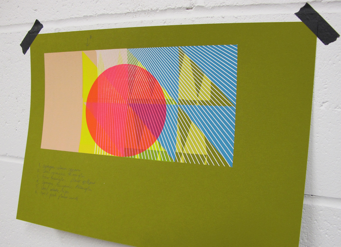
It's been thirteen months since I last released a Print Edition.  Mentally I've released many more since, unfortunately they never made the paper.  So now I'm preparing, testing & playing around with coloured textured stocks to avoid the blank white stare of my usual Fabriano and help shift me along a little.  I hope to get carried away with these twenty minute samples and before long turn around to a great pile of them.. probably after eyeing up this Wallpaper Sample book by Alex Girard.  


Thursday, 20 September 2012

'C, Y, M... K?'


Tonight I re-found this slightly bonkers image proposal for a 'Sonny J' single cover test, created a few years back.  Just as budgets for sleeve campaigns were truly dying out, myself & Patrick Duffy managed one last pop at silkscreening a set of sleeves, the starting point for each being the colour separation of various found photography.  (You definitely needed a decent expenses budget to tackle this.)  With my slightly self taught approach to the technical side of printing in CYMK in tact I took this shot after applying only the cyan, yellow & magenta.  When it looks like this, who needs the black? was my thinking.  Without its application it only enhanced an already pretty unusual image.

Friday, 14 September 2012

Hundreds & thousands..

I'm not exactly sure why I can't stop documenting these incidental details of recent prints in progress.  Working with pattern and layering up textures seems to conjure up a steady stream of printed revelations.  Each one a perfect & unique image to me, that would otherwise be lost.  It would be sad not to mention them..  ; -)


Friday, 7 September 2012

Monday, 3 September 2012

Satisfaction..


    .. is peeling back the masking film.  

Monday, 20 August 2012

'+81 Magazine'

                                       'Imprint', 210mm x 265mm, gouache & silkscreen on paper

I owe yet another BIG thank you to the brilliant people at '+81' Tokyo, for featuring me in their great Magazine.  A whole eight pages too, ; - )  This issues main focus is UK graphics & the Polish design scene.  I'm in amongst friends with another whole eight pages dedicated to 'Tappin Gofton', who I worked alongside with on The Chemical Brothers sleeves.  As well as a studio feature I was commissioned by '+81' in collaboration with leading Japanese sports brand Asics, to create a visual piece to advertise their Asics33 running shoes.  The brief was left very open & after a small discussion to learn about the shoe I decided to opt for a more painterly approach.  It seems very much the Japanese way to allow their choice of Artist complete creative freedom in order to gain their most honest and intuitive response.  Hence, creating the artwork was a lovely experience, free from the pressures of heavy deadlines and too many opinions!  Even when working in a medium that is still very new for me.