
Saturday, 29 December 2012

Saturday, 22 December 2012
Last job of the Year..

My last job of 2012.. well the rejects for it. The client & I decided to work in reverse and opted for a black ground. Would've been a shame for these to go un-acknowledged though. Happy Holidays, ; - )

Thursday, 13 December 2012
It's really nearly here ..

.. today my website has gone to be built. I'm not entirely sure what this entails so i'll leave the techy bits to the techy people & look forward to its glamorous return. It'll give me something to show orf' about in that hibernatory month of January.
Tuesday, 11 December 2012
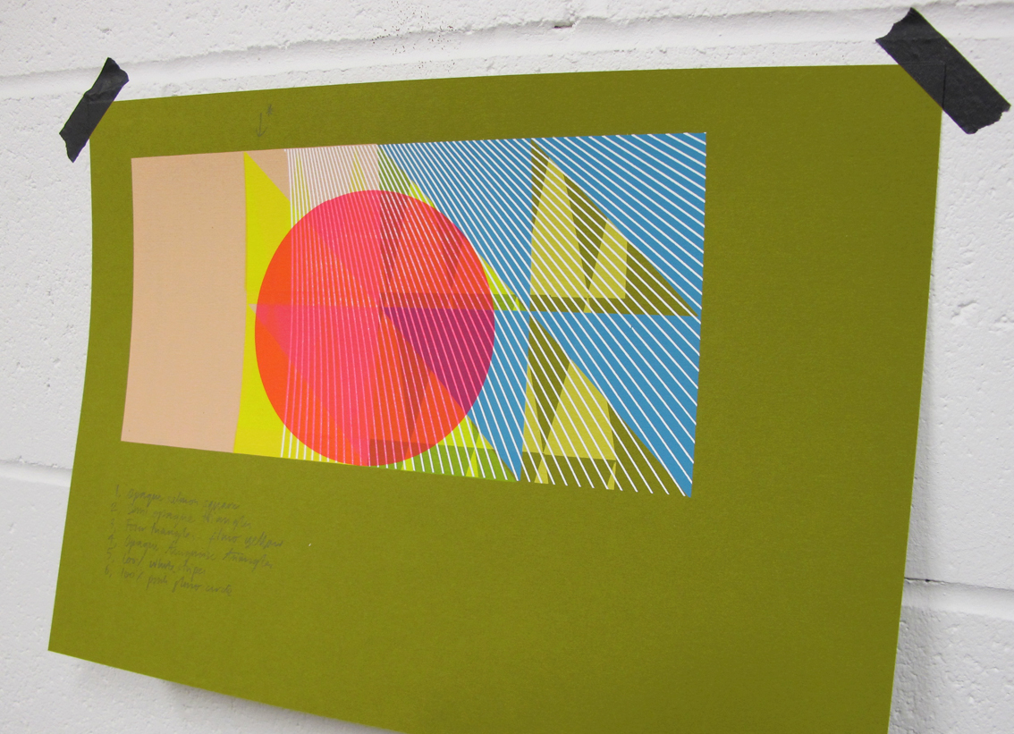
Variations of variations..


James & Ross from Creative Agency Two Times Elliott, approached me with their design for an attractive graphic two colour silkscreen. Rather than having 2o prints the same colour way, I decided to laboriously print one colour at a time, gradually building to a collection of 4o. Therefore each print would remain unique. Problems with screen 'snap' (I thought) leant in my favour.. the ink almost blotting itself against the screen mesh, leaving a textured half tone imprint as a kind of random third colour. Never wanting to print anything perfectly, these chance hiccups embellished their artwork along the way. Available to purchase any moment now from here..
Monday, 3 December 2012
Seasonally affected.. ?

It's that time of year again, heavy skies and a lot of grey. I wondered if my meteorological obsessions had in some way inspired me as I set about these fluorescent fades this afternoon. I certainly felt uplifted when the screen retracted to reveal these lovely luminescent shapes, glowing from the surface.

Friday, 30 November 2012

My feathered friends have become quite challenging so I'm contrasting them by playing around on some new abstracts pieces. It also gives me the opportunity to try my new table top printing press, courtesy of Luma Studio. Patented & built by Mark and Lucy, it makes registered screening a doddle.. and to think the suction could be provided by my busted up old hoover. Visually, it's a piece of Art in itself. Drop them a line for more info ; - )

Wednesday, 28 November 2012
'Tweet or Twitter..'

I'm busy playing with feathers for a new Bird edition.. it's a lengthy process, out takes of which can also be seen here..
Thursday, 22 November 2012
'100% Superfly'


I'd forgotten what fun it was playing around with bold colour options early last year on another of Stussy's markerpen'esque scribbly archive logo's .. until I saw them online today.
Friday, 16 November 2012

Sunday, 11 November 2012
'Weller' halftones..
The epitome of cool, Paul Weller & The Jam littered the late seventies and early eighties with many iconic images. When asked to turn these paragons of music and style in to silkscreened images, I wondered if I may be doing them an injustice. But on testing the newly made screens I reckon the silkscreened graphic halftone adds on another couple of cool points.. not that they needed any more.


(Test print, silkscreen on paper)
Monday, 5 November 2012
'The Granta Art Salon at The Hospital CLub'
Tonight I'll be joining the panel for Granta Magazines latest Salon event at The Hospital Club, which just happens to be an Illustration special. Having contributed pieces over the past couple of years, it's a pleasure to be part of tonights Salon event. Tickets are free, details here..

Wednesday, 24 October 2012


Wednesday, 10 October 2012
'Online Stussy Look-Book'

My most recent antics with Art Director Adam Weissman resulted in an online Look-Book. Stussy & Nike teamed up to release their 'S&S' Collection (that's Snow & Street to the less street of us) and commissioned a few silkscreens from me to help peruse their wares. I hadn't envisaged the problematical nature of creating a strong image when the majority of its content was white. Making monotone tests of various photographs allowed us to pick out the stronger ones and ditch a few along the way. A moment of panic saw me tear up a couple of similar prints neither of with were working and swap their respective sections. The resulting collage (shown above) I felt became my strongest piece.


Monday, 8 October 2012
'One from the top..'


Whilst preparing for future Editions I found myself back in a familiar dilemma with regards to how I sign, initial .. make my mark on them. I've never really been a fan of hand signing & if requested prefer to endorse the back of a print. With this in mind my super assistant Isabel created some innovative designs out of what only appears to me as two tricky consonants, one of which became a rubber stamp. In an ideal world it will appear embossed into the paper as opposed to inked.
Saturday, 29 September 2012

Tuesday, 25 September 2012
Prepping for new Editions, finally..
It's been thirteen months since I last released a Print Edition. Mentally I've released many more since, unfortunately they never made the paper. So now I'm preparing, testing & playing around with coloured textured stocks to avoid the blank white stare of my usual Fabriano and help shift me along a little. I hope to get carried away with these twenty minute samples and before long turn around to a great pile of them.. probably after eyeing up this Wallpaper Sample book by Alex Girard.

Thursday, 20 September 2012
'C, Y, M... K?'

Tonight I re-found this slightly bonkers image proposal for a 'Sonny J' single cover test, created a few years back. Just as budgets for sleeve campaigns were truly dying out, myself & Patrick Duffy managed one last pop at silkscreening a set of sleeves, the starting point for each being the colour separation of various found photography. (You definitely needed a decent expenses budget to tackle this.) With my slightly self taught approach to the technical side of printing in CYMK in tact I took this shot after applying only the cyan, yellow & magenta. When it looks like this, who needs the black? was my thinking. Without its application it only enhanced an already pretty unusual image.
Friday, 14 September 2012
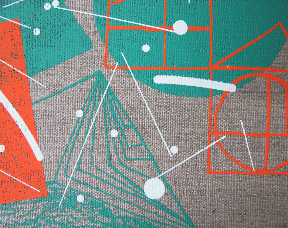
Hundreds & thousands..
I'm not exactly sure why I can't stop documenting these incidental details of recent prints in progress. Working with pattern and layering up textures seems to conjure up a steady stream of printed revelations. Each one a perfect & unique image to me, that would otherwise be lost. It would be sad not to mention them.. ; -)


Friday, 7 September 2012


Monday, 3 September 2012

Monday, 20 August 2012
'+81 Magazine'

'Imprint', 210mm x 265mm, gouache & silkscreen on paper
I owe yet another BIG thank you to the brilliant people at '+81' Tokyo, for featuring me in their great Magazine. A whole eight pages too, ; - ) This issues main focus is UK graphics & the Polish design scene. I'm in amongst friends with another whole eight pages dedicated to 'Tappin Gofton', who I worked alongside with on The Chemical Brothers sleeves. As well as a studio feature I was commissioned by '+81' in collaboration with leading Japanese sports brand Asics, to create a visual piece to advertise their Asics33 running shoes. The brief was left very open & after a small discussion to learn about the shoe I decided to opt for a more painterly approach. It seems very much the Japanese way to allow their choice of Artist complete creative freedom in order to gain their most honest and intuitive response. Hence, creating the artwork was a lovely experience, free from the pressures of heavy deadlines and too many opinions! Even when working in a medium that is still very new for me.

Tuesday, 14 August 2012
'Puma Yard'
Early Spring saw me team up with Creative Director Phil Sims from Neighbour, housed down East in Batemans Row. Excited to be involved with anything to do with the Olympics, (wasn't it A-mazing) Neighbour have being creating Jamaican themed promotional artworks for Puma, official sponsors of Usain Bolt. I was unaware that Olympians aren't able to endorse their sponsors products whilst the Games are on.. fair play. Neighbours natty direction allowed us to capture London folk showing their version of the Lightening Bolt, capturing the growing Olympic spirit as the Opening Ceremony approached. Alongside a revamp of their Carnaby Street store, Puma transformed Brick Lanes Truman Brewery into 'The Puma Yard' with many a rum cocktail and even a little beach!

Outside The Puma Yard, photograph by Kate Gibb
Creatively, turning the photographs in to a series of silkscreens was pretty straight forward. The majority of the images were to be treated in the colours of the Jamaican flag, for me this was hardest task. When given a free palette I can keep on going.. but green, gold & black felt nothing short of an Olympic challenge. But it was Neighbours spin on how they used the nineteen or so lightening-bolters that really made the job special. Fly-postered around the East End, layered up over shop fronts and what seemed to be almost ingrained in to the local brick work. A simple but striking idea.


Friday, 27 July 2012
Tuesday, 10 July 2012
'Studio 4, by Tomoko Suwa-Krull'

Our studios moved over two years ago, but I still reflect on the old Great Western building with a little more fondness than the new. I guess it's down to a lack of the inherent aged characteristics that new builds can only pass the time for. (Although the fully functioning heating system eased the blow a little.. ) Last weekend photographer Tomoko Suwa-Krull came to visit, on behalf of Japanese publication '+81'. I couldn't have dreamt her resulting images would pan almost the entire width from what appeared to be quite a small lens. The studio has a limited flow with its triangular floor space & my abundance of box shaped equipment. Looking at Tomoko's beautiful photographs reminded me that in essence not that much has really changed, how important studio life is to me and the creative charm this functioning space holds. See more of Tomoko's beautiful work here..
Saturday, 30 June 2012
A kind of Camouflage
I'm getting in to the habit of taking quick shots of my prints in progress, mainly to provide a stack of content from which to choose for my upcoming website. (There, now I've said it. ) It's handy to have a visual record of prints evolving, noting all the changes that occur en route only to disappear beneath the finished piece. On viewing, these shots can take on a life of their own and become (for me), like an experimental painting. Masking layers off and lifting out shapes from sticky back plastic to screen on another colour, I'd never remember what went on under there..


The crowd scene peeking through this fluro yellow sheen makes me want to ditch the illustration and continue building this figurative camouflage that's appeared. Unintentional and unexpected.. it's random appearance makes me like it even more.
Thursday, 21 June 2012
Warp&Weft

Weaving has always appeared to me as one helluva big effort.. I also enjoy the way pigment inks can sit quietly proud of the cloth, showing off its woven properties a little more. The best of both worlds. NousVous's second studio visit became a heady afternoon of applying drawings we had to hand, on a length of fabric resurrected from a sample pack that morning with the few coloured dyes that hadn't gone mouldy on closer inspection. It's early days aesthetically but screening ink directly on to fabric allowed us to appreciate the options of working on a more malleable surface. We're all keen to explore more.
Subscribe to:
Posts (Atom)